In Progress: Site Design
Last time with “In Progress: Logo Design” we talked about the client project I’m working on with Cameron Moll for the design and rebirth of the National Gazette, a previously-defunct newspaper more than 200 years old. After some revisions, the client decided on the logo direction—which you can now see on the placeholder site—and we proceeded on to layouts for the site design.
Cameron and I decided early on to show the client a good range of options. Because we realized that based on the direction, our designs might overlap a bit. Sometimes this can be a beneficial path to take. We figured that we might end up borrowing certain ideas from each comp after the first round of design anyway. I’m not usually in favor of “Frankenstein-ing” designs, but we agreed that ideas could likely be shared from our similar design sensibilities based on what was successful.
With that in mind, we tried to work both sides of the fence; I went with a design for 800 x 600 and Cameron went with a design for 1024 x 768, I experimented with using a background image for the page and Cameron went with heavy whitespace (and a more literal newspaper look), and those are just a couple of the differences. By looking at both you can see we were trying to cover a few subtle variations in style and structure to give the client some options.
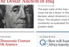
As is fairly customary, we presented mockups for two site pages (per each direction) for the client to get a pretty thorough idea of each design direction. Here are my proposed designs for the National Gazette Home Page and an Article Page.
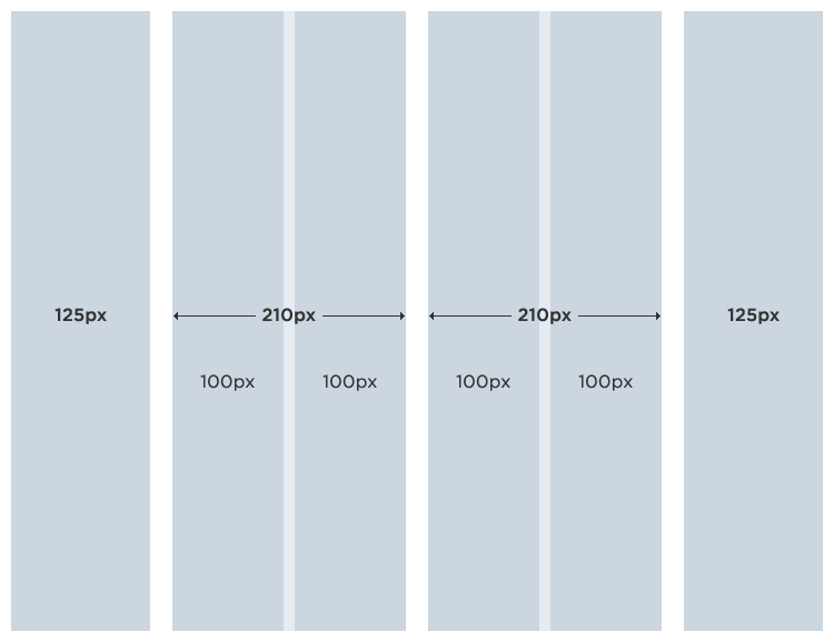
On my design, I went with a fairly basic, but flexible, column and grid structure. The outer columns are wide enough to support some common advertising sizes and the inner four columns are modular enough to support a good number of layout options (always a good plan for a editorial site). It’s amazing how much a copy-based site can feel like a blog just by it being fixed-width and optimized for 800px wide screens. Perhaps this is just because the proliferation of blogs in general has lead us down that path. I think I did a good job of breaking out of that by including the two columns of content in the middle topped with the larger feature story. I usually try to avoid drop-shadowed and similar column treatments, but I like how the background pattern turned out. It helps give the page a softer aesthetic and hint at a tactile, newsprint type of feel. This is essentially a newspaper, and that was one of the things the client really wanted to convey in the visuals. I tried to do this by limiting the palette to just some basic colors, and really only using color for emphasis and separation. The middle columns distinguish themselves from the rest of the page by picking up some of the reds and blues, helping to draw readers into the content areas and get them to the latest information.
Once again I feel the need to stipulate that these are pitch designs and as such some edges are rough. Some of the content and imagery we used is mock or otherwise not final. We are sharing them because we learn and enjoy seeing how other designers work, so we figure others might benefit from our efforts. Comments and criticisms are welcome of course, but please refrain from being irate or otherwise rude, because there is a lot of client-time and conversation you have not been privy to. We felt made the best decisions we could with the information and resources available to us at the time. Okay, enough for the disclaimer.
That’s about all I’m going to say about the design for now. Though, I will add that neither of our designs were chosen outright. The client liked both directions very much, and so did we. It’s always uplifting when you feel strongly about all the work you are presenting (the same way we did when we pitched the logos). So, you will just have to wait and see what design was chosen when the site launches.
In the meantime, check out Cameron’s site and read about his design for the National Gazette website.
- Posted at 9:54 am in Design, Web
 Commentary Closed (33)
Oh, so pretty. ;) Both of you… really nice. I like Cameron’s article page better only because I get distracted by things hanging around to the left of my reading space.
“the proliferation of blogs in general has lead us down that path”
For that I think you’re right. But I think the reason blogs work is because they are designed for reading lengthy content, so it’s totally appropriate for a news site to follow that model. In fact, with blogs growing in popularity and becoming so much more mainstream, it might be smart to make news sites closer resemble blogs for those already used to getting their news via the blogosphere.
So far so good. I really like the subtle background in the scenarios column on the home page mockup.
Inevitably, there are elements from both comps that I like. For example, I much prefer your colour-weighted topics compared to Cameron’s size-weighted. Anyways, I’ll stop from providing a full-on design critique. I’m sure you’ll both get enough of those.
Natalie: I understand what you mean about Cameron’s article page. But the more I think about it, the less I like losing the left navigation… because people won’t always be coming through the front door. And I don’t mean the blog comment in a bad way (I know you didn’t take it that way), I just mean that there is a certain stigma that goes along with it as well. Looking more like a organization and less like one person can go a long way. That just me though, even when I design a blog I try to stray from some of the visual associations when I can. If for nothing else than to make it a bit more distinctive.
Very clean, very unique, very nice!
I’m so glad you’re continuing to share this process. Not only is it highly informative and inspiring but these early elements you’re making public just go to prove how difficult it is to create good clean functional design. So many try but fall short by miles. Can’t wait to see more on this as it progresses.
Whoa! Both designs came out great. Some criticisms: Cameron’s is a bit wide for my taste, and the big feature is too big, effectively overwhelming the page and throwing off the hierarchy. And I agree with you about the article page, I think the left nav needs to stay. Your design is simple and completely appropriate. The little touches of color go a long way. Perfect! If they do Frankenstein them, I hope they go with yours as the base and pick up some of the bits from Cameron’s design too. Fabulous work guys!
P.S. - I actually wouldn’t mind seeing your design with your original logo 8-)
At a glance your design looks great. The only thing that jumps out at me is background pattern. On my monitor it kind of has a tendancy to “dance” a little bit. By dance I mean the sort of thing that you typically see on TV if someone were to wear a tie with a print like your background. You kind of see this optical illusion of movement.
Its pretty subtle but enough to be distracting to me. And I’m sure this will vary from monitor to monitor…and with people’s vision to some extent.
For whatever reason the similar blue background in the scenarios column doesn’t seem to do the dancing thing.
I do really like the white faded edges.
june: Great point about the pattern. It’s not vibrating for me, but I have seen that happen before so I know what you mean. Thanks for the heads up!
As always, yours and Cameron’s work is stunning.
I really enjoy following this project, you two do great work, and I’m impressed by both layouts. I’m anxious also, to see if they pick the bigger layout or not.
Keep it up, and thanks for sharing!
I really appreciate you documenting the process for us to see. I think it ultimately gives us web folk a good look at the different considerations we take into account and why certain decisions are made.
I’ll refrain from critiquing the designs since both yours and Cameron’s are way above anything I could dream up ;-)
Eric: Nah, don’t look at it that way. No one is un-critiquable. We are always open to comments.
I really appreciate you guys sharing this process with us. Seeing how the product is progressing and how each of you address the problem differently is very helpful.
Thanks for the article, I look forward to each one to see the progress you two are making.
I love both designs as you both took on two different aspects with page size. Honestly, one thing that stuck out is that you have a very clean look on the article page (and this may be just anal) but your icon’s for print, email and discuss don’t seem to fit. Maybe if it was toned down a bit. I am not trying to step on toes, just my observation.
I look forward to the next article. Thanks!
Jason, I love the design. It surely is one of the best designed newspaper websites I have come across.
When I first looked at the site everything was clear to me immediately except of the Feature Article. I wasn’t sure if the text on the right side of the photo is associated with this photo or it belongs to the light blue column below.
Other than that it’s a pleasure to look at and read.
I quite like the handling of the central columns on the homepage. I think Jaro has a point about the Feature Article copy, but I don’t feel it’s a huge problem.
Man… 4 columns in 800x600 equals quite a wrasslin’ match for readable text. But well-handled, Stanislaus!
Nice work to you both. Definitely agree about keeping the left nav throughout the site. I have possibly a dumb question, though. In your grid structure, why are the two middle columns split into four 100px wide columns? Thanks for the insight into your design process. Very interesting…
Alain: That’s not a dumb question at all! The reason the middle columns are split into smaller columns is so that we can provide more options for layout. By creating more modular grid, we are setting up the framework to deal with a larger variety of content types, while hopefully not feeling like we are trapped in a monotonous one-column world.
As you can see in practice on the Article Page, to the right of the large image I’ve made use of the half-column for the photos and article’s contextual links. The grid helps you set up and maintain conventions which people begin to associate and expect within your site. Put simply, breaking up the grid like this give us a bit more flexibility and also helps reinforce the graphical language we are establishing with the site design.
As one of the designers initially contacted for this project, but in the end losing out to the two of you, I have to say your work looks great. I thought it mighty fine to even be considered for this in your company, and felt no ill will when Daniel informed me he was going to take up the opportunity to have you guys work on this. Great job.
Your layout looks great to me at 800 but at 1024 I found the borders took away the original clean look. I prefer your masthead over Cameron’s but like would swap with Cameron his menu bar. His menu shading seem more tied to your masterhead.
All in all, great work guys.
Overall two awesome designs, but a few things bothered me -
The first is the scanlines as a background image because a) I didn’t find them as sutble as others and b) they do jump/jiggle while scrolling in Safari for me. The second is the blue and gray bars that are above the Opinions and Scenarios as they visually break up the headline article making the text and image appear more separate. A final thing I would consider is using a typeface more similar to Camerons for the content.
Great work! :)
Jason, I think the strength of your design concept is usability.
When I first saw both designs, I found Cameron’s strikingly beautiful… Very elegant and polished, and with design details I usually see only in print pieces. Your design became more attractive to me when I started looking at it as a web user (not a designer).
Your main nav marker is more visible. Your side navigation is persistent and in the place where the average user expects it. I definitely would not want to lose that side nav in article pages. I prefer your presentation of tags over Cameron’s (not sure that the average web user is familiar with tag clouds, but I may be wrong), anyway, in a news publication I prefer to see tags at the same font size, with a more traditional presentation like yours. And your font sizes are comfortably readable.
Nit-picking.…
In your home page, the featured article doesn’t seem to carry enough visual weight. Because it is separated from the areas below with 2 equal strokes, it also looks split to me.
Assuming that “Scenarios” is less important than “Opinions” I keep wanting the scenarios block to be narrower (I realize the content of this section is long). The symmetry bothers me, but more importantly, I just don’t get which of the two sections is suposed to be more important. What should I read first?
Overall, I think the perfect Frankenstein design would combine the user-friendliness of your concept with the elegant details of Cameron’s.
Great set of posts from both of you.
1024x768 CANNOT be allowed on this website. I am aware of the reasons for ALA making that decision, but the National Gazette’s audience is different to ALA’s. I would insist on 800x600.
As it turns out, I think Jason’s design is cleaner than Cameron’s anyway. I feel that Cameron’s over-columning distracts the eyes from everything! I don’t know where to look. On Jason’s design I can quite clearly identify headings etc.
Once criticism of Jason’s design, is that the navigation does not fit on my screen, it goes off the bottom. I am using 1280x1024 and I am able to see Cameron’s entire navigation menu on the screen. Perhaps if Jason could find a way to move-up his navigation, that could prove useful to some readers.
Oh and i’d like to see a National Gazette favicon !
I love the designs, everything is very boxy which I like, especially since that is how newspapers generally are… The only thing I find “odd” is that the background has the gradient overlapping to the content? I feels like the content is just sortof “vanishing”? Just my perception I guess? Many many boxes and hard edges with a very very soft BG Gradient. I’m just nitpicking though. Overall, very nice =)
I’ve enjoyed seeing your process revealed in this project, but I had to question why the National Gazette chose both you and Cameron. At first I thought, “Why would they double their cost of designing their site by using two designers in this way?”. I mean it doesn’t seem like there is a high volume of collaboration other than knowing the requirements. It seems that you both are kind of working in a vacuum and playing a friendly game of War with your designs.
There seem to be only two possible answers to my question. 1) The stakeholders felt like two brains are better than one, and that taking the best of both of your ideas would result in the best possible design. Or 2) Because it builds buzz for their upcoming venture to have two designers, with well-read blogs, working together on their project and sharing their individual processes with their audiences along the way.
If it’s the latter, that’s a pretty smart idea. If it’s both, that’s probably even smarter.
Brain Sweeting: It’s actually neither of those :D
Through a mixup, the client contacted both of us with the same message. So I emailed Cameron and we decided that we could both tackle the job (since it seemed like a cool project to begin with) and offset costs a bit. The client liked our idea, and off we went.
Quite to the contrary, Cameron and I didn’t work in a vacuum, we collaborated, critiqued and discussed our designs the entire time. As I said in the post, we really hatched a plan between us for how our comps would come together. The idea of blogging about it came sometime during the logo design process. We were happy with the client and how the project was progressing, so we thought it might be nice to share. I always love getting insight into how a project comes together, so it seemed like a natural choice.
So it was neither. Oh well, it really is a nice side-benefit for them anyway. I probably wouldn’t have heard about the National Gazette if it weren’t for your blogs. Now I’m looking forward to it’s debut.
Both you and Cameron have provided a source of great inspiration and knowledge! And none more timely for some of us who might be preparing to have a crack at the Slashdot .css redesign which was announced this week. Good luck with your work. Kudos.
Hey Jason! Just wanted to thank you and Cameron for taking us through your design process. Very informative and very inspiring. I really love your color scheme with the little hits of soft blue, letting the design feel a little modern and breaking from all the black and white. My favorite part, though, is your detail in the logo treatment. Just adding that shadow gives it a good amount of pop. Great job!
The first thing I thought of when looking at your design, Jason, was Rob meets Coudal. The masthead and top navigation really bring Rob’s site to mind and the way you’ve formatted the headings recalls Coudal, all caps, Gill Sans (?), and light gray (although they recently switched to a light green, instead).
I like Cameron’s masthead and navigation better. The laurel branch between the day and date is a nice touch, though I don’t care for the gradient on his nav background. I wonder if your typeface for the navigation would be better in Cameron’s design. Also, his use of whitespace appeals to me more. But the width of your design is right on; it should be 800x600.
I agree with Maria (#23 up there): Cameron’s column for Featured Articles is wider than the one for Scenarios. That’s as it should be since one column needs to be more important than the other. But his columns for “Inside” and “Popular Tags” are more distracting than yours. Your sidebar material is more pleasing and formatted in a way users will expect, but not so much that it makes the page look jumbled, as Cameron’s does on lower-resolution monitors.
Cooper (#22) also has a point: Cameron’s typefaces strike me as more appropriate. That formatting also helps set the Feature Article column as more important and the sidebar content as less important.
The touches of color you’ve both added to the designs are nice and I hope those stick around.
As others have said, this is nice work that shows professionalism and care for the craft. That’s a lot of information to cram into an 800x600 layout! The combination that comes from this will be spectacular.
And I’ll assume that it won’t wander off and kill a bunch of people like Frankenstein’s Monster did, so that’s a good thing.
Todd: Yup, the similarities between Rob and Coudal are evident. Coudal’s site (and Rob’s for that matter) has that same newpaper idea going for it. Rob is a a very close friend of mine, we went to school together and share similar design sensibilities, so I’m not surprised that we continue to influence and inspire each other’s work.
This project was an interesting challenge too, and I definitely ended up with a different design than I would have if I did it on my own. By that I mean that we went into this almost orchestrating both comps at the same time. So, if Cameron did one treatment on his site, I deliberately took a different route to give the client a better spread of options. The reason this was tough is because Cameron and I also have very similar sensibilities. For instance, I tried to avoid the same type treatments I used on A List Apart, and things like the branch/leafy graphic like Cameron used. Because of this, it’s weird for me to think to heavily that my comp is truly “my comp”. It’s more a set of solutions for the problems at hand and like I said, meant to work in tandem as both comps.
Anyway, thanks very much for the feedback and comments, Todd (and everyone). there has been some great discussion here and on Cameron’s site, and some things we will take into consideration as we work on the revisions.
I’ll be the 100th-something person to add - thank you for sharing the design process for this project with us. It’s really cool to see such talented designers “at work” from the logo through the site and visual identity. Great work!