ian’s right. applebee’s is on the list for a lot of things—especially their grammatically torturous “eatin’ good in the neighborhood” slogan. and their food is dire.
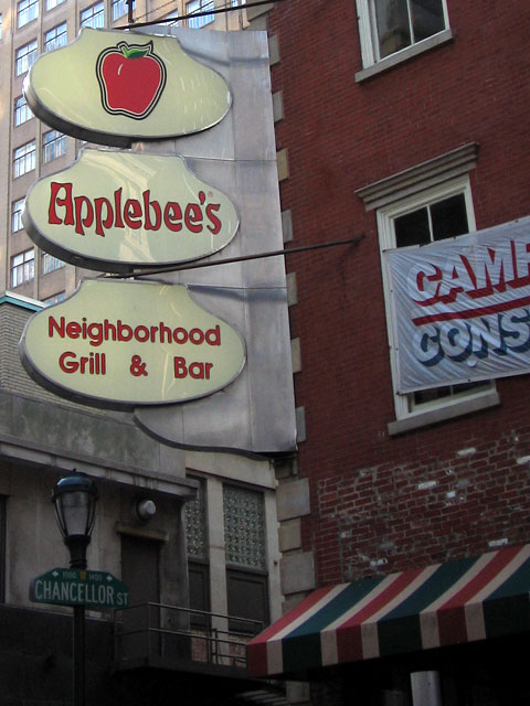
If you blur your eyes you can imagine that the designer (or CEO’s nephew) was trying to create a Japanese temple-type shape.
Which really fits the brand. I don’t know how many times that place has made me consider hari-kiri.
 Commentary Closed (5)
Applebee’s should do a lot of things. Like stop cooking ‘food.’
ian’s right. applebee’s is on the list for a lot of things—especially their grammatically torturous “eatin’ good in the neighborhood” slogan. and their food is dire.
Yeah, really, poor type selection is among the least of Applebee’s crimes against society…
Well, type choices aside, I’m mostly talking about the awful typography in “Neighborhood Grill & Bar”.
reallytighttype
reallytighttype [S P A C E] & [S P A C E] reallytighttype
If you blur your eyes you can imagine that the designer (or CEO’s nephew) was trying to create a Japanese temple-type shape.
Which really fits the brand. I don’t know how many times that place has made me consider hari-kiri.