Aged Aesthetic
As a companion piece to Cameron Moll’s That Wicked Worn Look series, I decided I would chime in with a few kernels of knowledge. Though there are many types of worn aesthetics, as you can see by my site, I love the look of aged print materials. There is a history and esteemed nostalgia associated with old editions of literature and other printed materials that just speaks to me. I often like to entertain a notion where I’m not a general graphic designer (lately, more of an interactive designer), but instead working in book jacket design. Maybe I just want to be Chip Kidd.
A Teaspoon of Theory
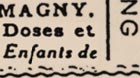
 Old type and torn edges
The internet is an ageless medium. Obviously, if I put up a site and leave it for a few years, its stylistic appeal will most likely dwindle because of trends moving forward, but it will not physically age and there is no physical decay. When you create something with a worn and aged look, you are emulating the passage of time and the systematic breakdown of matter. Printed materials decay. Yellowing pages, moisture stains, handling, rips, tears, folds bumps, scratches and burns are all signs of usage and breakdown. The more you analyze the real thing, instead of just the reproduction, the more you will appreciate those artists that came before you, and consequently, the more competence and life you be able to impart to your work. As long as I am a designer and an artist, I will study art, new and old. It doesn’t stop when you leave school, that is, if it’s not just a job to you.
A Brief Interlude
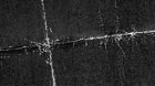
 Trapping overlap
Why do you want to make your design look old? Generally, as with most design, you should do it for a reason and to support your design’s concept. Designers are visual communicators, and any one of them worth their salt can usually account for the purpose of a given element in a design. Don’t get me wrong, I’m not living in a gumdrop house on lollypop lane. I realize it’s not always possible in the world of client thumbprints and deadlines, but for personal work where you are the boss this should be a paramount goal. Design that is old looking or vintage for the sake of it, usually appears thin, with barely a leg to stand on. Are you making something look old because it supports a concept, or are you doing it because it looks cool? Substance and style work hand in hand.
Building a Reference Library
 Dot Gain, watch it bleed
One of the best ways to educate yourself about an aged aesthetic is to look for reference. Seek out old materials. Good places to start include: thrift stores, garage sales, libraries, used book shops and your dear grandmother’s attic (great for digging up old photos and press clippings) are all potential treasure troves. One added benefit of this is many old publications are obviously pre-computer and consequently have beautiful handmade typography and ornamentation. Pay close attention to where your materials were found (any moisture nearby?), year of origin or time period, and possibly any history attached to them. Look for printing mishaps like too much ink coverage (resulting in blotty letters), poor trapping, and out of register prints, some hallmarks of older print production techniques. These are just a few factors that can aide you in your conceptual execution.
Even if you are designing strictly for the web, you still need to know what you are trying to replicate. When you obtain materials, get a feel for their dimensions and physicality. This will help you better understand how to emulate them. Don’t just look at them. Feel their texture. Study how light is absorbed and reflected by them. The better you understand what it is you are emulating, the more realistic the effect will be.
Over the years I have amassed quite a bit of reference material from aesthetics and visuals for various time periods, styles, and effects. Lately I have taken to using iPhoto to categorize the collection by varying degrees like styles, or effects (crumbling paper).
Making Your Own
 Inkjet folding effect
When all else fails, create your own. Most textural effects exist in meatspace already, so why not use them? You can achieve many beautiful aged looks by some simple analog methods. Tea Staining paper will instantly shave years off its visual life, and create some happy mistakes like liquid gradations which are tough to emulate from scratch on the computer. Ink washes and brush splattering can create some amazing abstract wear and textural “decay beatings” which can be used as overlay applications. Scorch the edges of a page with your favorite fire starter (under supervision of a parent or guardian). Create realistic folds and paper splits by printing out a full sheet of flat black ink on your laser jet. Fold it back and forth to break the top layers of the paper and create a bright white crease. Scan it in and apply to your design. This is one of the few times its ok to use to use the Magic Wand tool. Since the resolution is so low for screen production, you won’t notice the stray and cut-off pixels as you would in a printed piece. The web is a much more forgiving medium. Take some invisible tape to that same black print and peel it on and off the surface to create a weathered texture. Use your imagination! It’s so much more fun to create these textures by hand.
In Closing
Obviously, this is a very generalized look at using weathered and distressed looks. One of the main things to remember is not to overdo it, a little really does go a long way. In the case of this site, I had some comps that were much more worn and beat up looking (especially in the nav and horizontal separators), but I ended up scraping them because they were too obtuse. The amount I settled on was just enough to complete the feeling and get the aesthetic across. These are not hard and fast rules. Some people prefer to do everything in Photoshop with filters in hand (tool). This may work for some projects, but seem generic for others. Above all else, be creative and don’t limit yourself to the tools sitting right in front of you.
For further reading, try on some of these other companion articles:
- Cameron Moll – That Wicked Worn Look Part 4: Expert Guest Gala
- Blake M. Scarbrough – The Awesome Antiquated Look
- Red Labor – Analogue
- Monc – Time Traveling
- Ryan Sims – Weathering: Subtle. Restrained.
- Greg Storey – Academics of Worn
- Posted at 6:08 am in Design, Web
 Commentary Closed (12)
I’m glad you’re encouraging people to try and re-create textured effects from the physical first. The effect is much more authentic that way, plus you can really appreciate the execution.
I may have an idea why you would want to do this (aside from it looking cool).
It’s a simple psychology solution:
People love the odd and unnatural, it’s attractive to see things in ways that you know they were never meant to be seen, even in a subliminal form. Seeing a website “whither, blister, burn and peel” is the mental equivalent (at least to designers) to seeing a pink whale, or a pine tree with large blooming flowers. Granted, it’s much easier to make a website look like that than it is to create those other events, but I’m simply comparing perception rather than execution at this point. Things that don’t happen in a norml course of events are more appealing to the curiosity of the bizarre. I mentioned subliminal because it’s also not something that gets thought about too deeply, as much reacted to.
“There’s something about that I really like but I can’t quite put my finger on it…”
Peace.
Only a little off topic:
While I love aged documents, when it is done as an effect on printed pieces it never works for me. But I love your site’s design and Moll’s site too. (Btw: How did you get Part Four before the rest of us?!)
I wondered why onscreen it’s not so bad, but on a printed piece it seems phony. Then I realized: the smell… Aged documents have a certain smell that is absolutely wonderful. It’s too bad there isn’t a way to incorporate smell into a design…
Two quick examples, one lowbrow, the other highbrow:
Back in the 80s, before comic book collecting was considered hip, I walked into a dark, dinghy comic book store. The odor was intoxicating and I bought a bunch of old Archie comics, because they were the cheapest ones there that had that smell in the pages. Now, unfortunately, most of the comic stores have bright lights and don’t smell…
Dublin’s Trinity College has a tourist area called Long Hall featuring over 200,000 old manuscripts. That scent kept me in the room for an hour.
Do you think I could get it bottled?
I have a little stash of messed up photo copies that I use when I want a worn look. I’ve also painted a piece of bristal board with black ink, scraped it with a razor blade and then splotched it up with white out to create an interesting “rain storm” effect. Works great in comics.
I’ve scanned in some spreads from a 1911 pocket manual for insurance agents. The ratty linen cover is on this page, and if you click through to the three images you can see scan from the beginning, middle, and end of the book.
The paper is an especially great aged color and the typography is typical for the era.
The well worn aged look has worked for me using old printing plates . The back of these aluminum plates get stained from gumming, ink and so on, they also prone to scratching in varying degress and the denting is similar to creasing.
Added textures for paper etc can be applied as overlays in photoshop, This method also provides work for metalic textures with aged effect, particulary when held skewed etc over the scanner. I have a few examples if anyone would like them, just e-mail me.
It’s incredible how incestuous the design community is … one person does a piece on weathering and suddenly there are tutorials and antique-looking site designs all over the web. I think this is a bit of a shame as we’re now going to see a huge amount of sites going for this look without the visual communication reasoning that professionals such as Jason so rightly emphasise. Chalk up another rash of style over substance. Is it any wonder it’s getting harder and harder for us to get clients to take us seriously?
Take one look at my blog site however … damn, I’m just like all the rest. Are we continually subject to the ebb and flow of a worldwide design zeitgeist? Or are designers in general just incredibly unoriginal? Reminds me of the year when everyone started using Trade Gothic …
Hey, I use Trade Gothic!
I know exactly what you mean Peter, which is why you don’t see source files accompanying this post. When Cameron asked us to do this, I had some reservations. I think that code snippets and workarounds are well and good to share, but not to give away your designs pre-packaged. The other designers are very talented, I just didn’t share the same views. So that is why you have my less exciting post about theory and practice.
C’mon Peter, your site looks like everyone else’s because you are using a mod of Dominey’s Scribe template for Blogger :D (nice type in your masthead)
Great advice Jason!
One other reason to use such techniques: to present content that actually exists in such a physical state.
When we posted this sketchbook of drawings of Samuel Beckett on the Tom Phillips website, we wanted the thumbnail view to LOOK LIKE a sketchbook.
It was easier to shoot the images without the page edges (as can be seen from the zoomed versions), then drop them into a single full-spread image of the book with page edges and gutter.
It doesn’t look “antiquated,” it just looks more like “what it is” than it would have otherwise.
Thanks again for your contribution to the series!
Well, the site is beautiful, I know nothing of how to accomplish these works of art, I didn’t understand any of what I read, but I enjoyed looking at the pictures, the layout, the design- magnificent- I came by way of cameronmoll, and then by cameronmoll I came from dooce-
Nice work!
Fear not Jason, my corporate face (I’ve linked to my business site this time) is Trade Gothic. And yeah, I changed the graphics on Dominey’s template for my blog (‘cause I was too lazy/busy to code my own from scratch) - though I’ve been fiddling with the antique book look for ages, the template made me get on with it. Mea culpa!
BTW I did very much enjoy your article and it sounds like you picked up on my complimentary tone to you personally despite my notes about design fads sweeping the globe. It’s an interesting topic for discussion, and one I’m sure we’ve all thought about - how much ‘originality’ do we really achieve in our designs? Despite our protestations to the contrary, are we really just ‘prettying up’ information for a living and following fads?
I think we have a long slow climb back up to the place where people recognise designers as visual communicators and not people ‘playing’ for a living. It’s the payback for all those companies who sold themselves as ‘cool guys doing cool stuff’ during the dot com boom, and the hordes of people who muscled in on the graphic design industry as a result.
I’m as guilty as the next designer, but in the past few years I’ve tried to emphasise to clients even more that I am here to communicate information in the most effective way, not to use their budgets as an excuse to play with software.
Urk … I’ve got all soapboxy. Sorry Jason. Love your blog mate.
^ woe is me.
a bit late on this one…but this was a great post…the weathered look isn’t my style, mostly because it looks forced when i do it, but i definitely like what you’re doing.
i recently came across this excellent resource.
i especially like this.
anyway — love the site, keep up the good work, all hail jsm the king of css. praise thee. amen.