Grey Box Methodology
After I read Underline Text in Adobe Illustrator by Douglas Bowman last week, it got me thinking about my own process for designing a website. The main point of his article focuses on not being able to underline text simply in Illustrator (which is quite annoying) and his solution and workaround. Afterwards, there was some interesting discussion about what programs people use to create their designs and why. This caused some self reflection on my methods and how they have changed over the years.
More and more I find myself employing a new beginning process for websites. I mean, I still start the way you really should with any design work, with a pencil and paper, but up until recently, after a sketching phase I would move on to Photoshop and begin producing a final mockup. Within the past year as I have started using CSS and smarter XHTML (in addition to the Flash I already knew), I began getting caught up when making the jump. The reason was that I knew how to do so much more. In turn, I began over thinking my designs as I was doing them. Rather than focusing on producing the visuals I had worked through in my sketches, I was trying to see how I could incorporate CSS into the site’s build. Some of you might work this way to great success, but for me it was like shooting myself in the foot. It’s easy for me to get hung up on what is possible and the technical limitations of something like CSS or Flash while I am designing. I prefer to have a much more open thinking process so that I can blow out the design. If I need to lasso it in a little later because I am unable to get an effect to work in CSS or because of some other technical limitation, so be it. But before that, I would like to create the best design I can. Not create the best CSS design or Flash design. The programs and the code are just the means to convey my message. I find that when I create, free of the means to the end of my design, things that I originally didn’t think were possible become new challenges to discover and I find the ways to create them. This is how new ideas and innovations happen.
For web design, the key for me is to split my design process up into smaller chunks. If they overlap too much, I have trouble making sure certain things are done before moving on. If I move into Photoshop too soon, my focus is drawn away from the structural build of the page because I may get caught up in finding the right font or color.
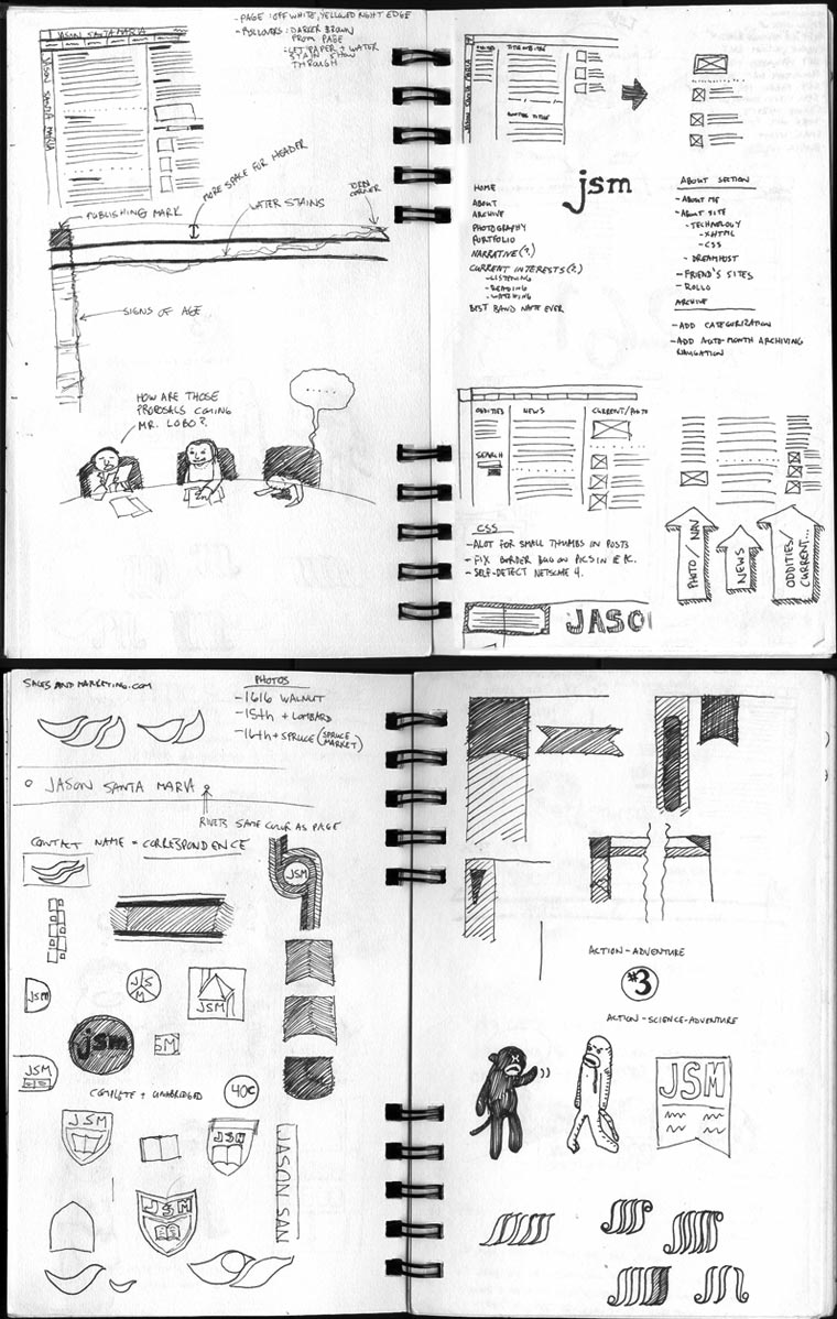
Let me show you what I mean. Take a look at some of my early sketches and notes from my website (pay no attention to the sock monkeys). When I first started my design process for this site, I had an idea of some of the visuals and aesthetics I was possibly going to incorporate, but I still started with sketches. Sketching out your ideas is still one of the most important parts of any design. I believe it is still the fastest way to brainstorm and see your ideas, make your mistakes and build off of them, and to see your progression through to ideas you never thought of before. The second you move from your head to the computer, you open the door to a world of options. This is a good thing in theory, but because of how many different and refined options like type choices and photography you are privy to, it is entirely human to get lost in the details. By sketching first you allow yourself time to really focus on the idea you need in a rough enough stage to not get hung up on things like imagery and color usage and kerning.
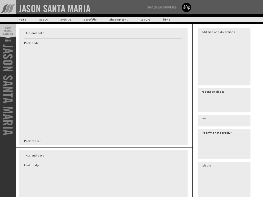
After the sketch I moved into Illustrator for what I call the Grey Box Method. This step could be done in Photoshop, but I prefer Illustrator for its immediate and resolution independent shape and size altering capabilities. Since I now I have a good idea of the structural layout of my site from my earlier sketches, I can apply real-world values and proportions to my layout. The Transform palette is your friend. I can remove myself from worrying about color and imagery choices and allow myself to focus on the site’s structure and hierarchy. I can plot out space relative to importance and insure that the overall architecture of the site makes sense with the flow of the project. Look at the screenshot of an early comp of this site. You will notice some things have changed in the final version, but the underlying structure is still intact from my grey box comp. I plotted out all of my content areas with numeric values and made sure that the flow of content and structural hierarchy are in place. This is more developed than some of my grey box comps in that I have dropped in a logo and took a stab at contrast values. I made this small short-step before Photoshop because it was my personal site and, thanks to this process, I had such a good vision of what I wanted in my head.
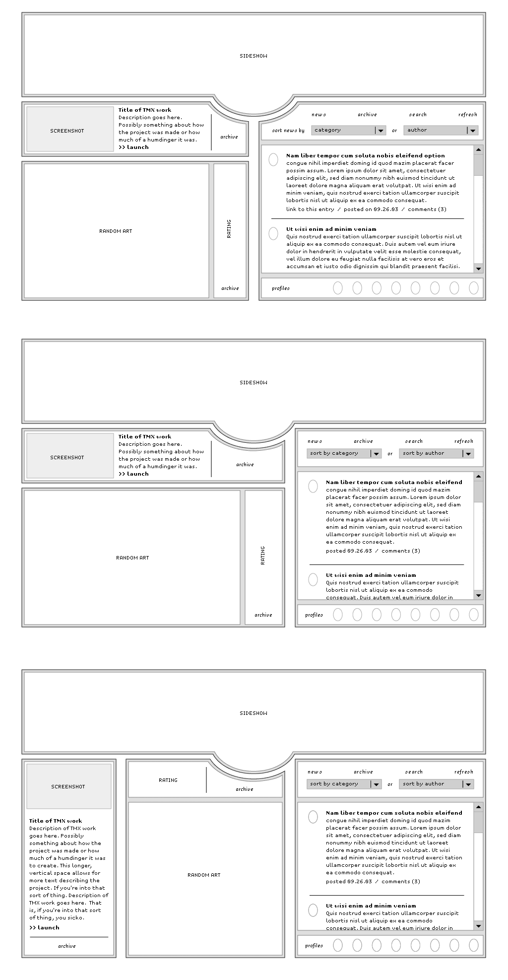
For another, more simple example, look at the grey box comps I did for our recent Sideshow website (no longer online; a mockup can be seen here). You will see three layouts, all similar, but structurally different. All three contained the proposed masthead but underneath they differ; the first a symmetrical two-column layout, the second an asymmetrical two-column layout, and the third a three-column layout. If you’ve been to Sideshow, you will see we chose the second layout. After this step, because I had created a strong underlying structure (with Sideshow or with my site), I freed myself to lend my attention to the detailed visual work. The best part of this is when I addressed any layout problems beforehand, I felt more confident to make changes to the layout to accommodate for certain visual intricacies. A few pixels here or there, but the underlying structure remains intact.
In the same way an author makes an outline before writing a book, this serves as my visual outline before creating a design. This is just one approach, and it just happens to make sense to me for the way I work. There are plenty more approaches and plenty more avenues to a successful design. I don’t go through this process every time I design, there isn’t always the time or the need, but when its in order I find this method keeps me structurally organized and frees me up to be more creative when I need to be. There are times when I have created websites almost entirely in Illustrator because I know the client will need some of the assets I create for supplemental print materials and promotion, in which case I need my artwork to be available at a high (or flexible) resolution for output. When I design for Flash, Illustrator is also the optimal choice because my graphics are already in vectors for quick importing. Long ago when I would start a design I would jump right onto the computer and start pushing type and boxes around. What I would end up with were ill-fated and remarkably bland designs that would inevitably fall flat because they weren’t grounded by a solid design structure. But, breaking this process up into steps, whether by the Grey Box Method or not, covers your ass and makes you consider your design choices and foundation before you are swept away by the details of your visual decisions.
- Posted at 12:08 am in Design, Site
 Commentary Closed (26)
Very interesting insight into your methodology.
I would have to agree with most of what you said, as I firmly believe that good planning is essential to the layout/design of any site.
I also think that this layout method needs to be applied to the site hierarchy as well, because it is just as equally important. Even though your not worrying about colors, textures, and graphics, you are concerned with the flow from directory to directory, drawing on common elements on each page, and how exactly everything fits together. If you do not get this right beforehand, it too can make for problems as you get going further.
So, I would say first would be the visual sketching, followed by the “technical” sketching, then lastly moving into the actual production of real pages.
Anyways, nice thoughts you’ve put down here, and I just wanted to say so!
Thanks 8-)
Agreed. Though I didn’t touch on it, this process assumes that sitemaps and information flows have already been worked out. I certainly had a sitemap before I got to this point on my site. You may be able to find the beginnings on one of the sketch pages if you have a magnifying glass.
My only worry with working that way is that process leads to habit, which sometimes leads to creative tunnel-vision. Sometimes you gotta mix it up, and ignore the illustrator layouts, to avoid being stuck in blocks and boxes…
Very nice write-up. I’m always interested in other designer’s processes. It’s also good to know that there are other designers out there that still start with pencil and paper. I’ve run into many others that just head straight for the computer…I can’t do that.
Maybe it’s a Kutztown thing?
Let me start off by saying that I’m coming into web design from the programming side instead of the design side. That said, I don’t understand the purpose of redrawing in illustrator/photoshop, what do these nicer looking drawings give you over your sketches?
As for my process:
The paper design sketches are crucial to get the general structure, but I jump directly from there to the browser. I then take advantage of Jesse Rudderman’s edit styles bookmarklet to rapidly prototype type/color/fine spacing. It takes me about 30 minutes to set up an appropraite test page and about an hour and a half to style and make up my mind on what I’m doing (most of the styling gets done in the first half hour, the rest is making up my mind). I then put it away and go back a few days later.
Like I said Karl, this may not work for everyone. Your method doesn’t work for me because I am coming at this from a designer’s point of view. If I move directly from my sketches to programming I am immediately limiting my resources to what is readily available within the constrains of language I am using. If I take an intermediate step by laying things out and experimenting with type and color in a far more flexible environment than the coding space, I end up with much better results than I would have before.
the most important thing is just:
first non-pc thinking and sketching on real life paper
then
get behind the pc and start on the layout
for the rest, there are various methods, but this always returns with most of the web designers ..
I have found that this method makes it much easier in the long-run. I call it “wire-frames”, but basically the same thing. It allows you to look at a layout and really see how it will function from a usability stand-point. Illustrator is great for this although I have never used it to creat the final layout, Photoshop always seems necessary at some point.
Jason,
I love you photo page.…Is there any way I could get that java.….?
Let me know, I would greatly appreciate it!!!
I tend to work up comps in photoshop, but am intrigued at using Illustrator instead, for the stated reasons. One question I have: once you have your gray-box version in Illustrator, what is your next step? Do you open that into Photoshop and colorize it, or do you keep most (or all) of the graphics in Illustrator the whole way?
It really varies from site to site, depending on what the visual construct is going to look like. But generally, after I feel resolved in Illustrator, I export to a layered PSD. This is handy for me because I am really organized in Illustrator already, using layers and making sure everything lines up on whole-pixel values. Then I either use the shapes I created in Illustrator, or I work over top of the layout and skin it.
Fireworks has been a good for quick design and layout. It has similar tools native to both Illustrator and photoshop. It’s not perfect in the this regard but I find myself using it more and more. And yes.. you can select ‘underline’ for your text! It’s a beautiful thing.
Awesome article. I come from more of developers perspective, so my sites tend not to be too visually interesting. This is a fantastic starting point for me to think about web design differently, even if I’m not going to be designing sites as complex as yours.
Thanks, Jason.
Hi Jason
Good article. Like others have said its interesting to hear how other designers operate. My process is similar in that I grab a pencil and paper to sketch out ideas, but unfortunately the kid in me takes over and I can’t wait to start messing with colours and fonts - maybe I should learn to be a tad more restrained :)
Nice article. Thanks
Steve
Very nice insight. I’m a little bit obsessed with process lately, and I’m always interested in other people’s methods, especially when they produce such nice results.
I always have a tendency to get bogged down in color and detail too early, which always leads to lots of starting over. The grey box method is an interesting compromise. I’ll try it.
jason,
when i start designing a logo, i mostly [unless requested by a client] begin with flat black, no colour. i never thought of designing a website in the same manner, it makes total sense! great article, turned my head totally. thanks
ps: your site designs are sooo lucious
cat
Thanks for sharing, truly inspiring stuff!
I was thinking maybe you could post a little tutorial on how to do this in Illustrator. I use photoshop and realize how much it is lacking by reading this post. I tried to find some tutorials on the web geared toward webpage layouts in Illustrator but can’t find anything. Maybe if you have a good link for an Illustrator beginner :)
Cat- exactly the same line of thinking. I don’t know why I didn’t put that together before :D
Teryy - Well, there isn’t too much to it beyond keeping yourself organized. I created quick templates a while ago that have safe areas already plotted out with guides for all orientations (centered, left, etc). After that I just rely heavily on the Transform and align Palettes, making sure all of my shapes have whole-pixel values and align precisely where they are supposed to with crisp edges intact. But, once again, this is the way I work and I try to remain very organized. You could throw stuff around on the page and leave precision behind, but it will catch up with you. You will either have to address it later in Photoshop or when you start programming.
Really enjoyed your article, and glad that it makes me rethink how I do things.
I am the bane of my life with my ‘option addiction’. I think all the designers who use computers know what I’m talking about. Too soon into picking options - be that fonts, styles, colors. Still, admiting I have a problem will help me get better!
I especially enjoyed your sketchbook. Always interesting to see.
I too think it’s a great method to start by drawing you concept. And if you work with several people, they do get your vision and plans :P That has saved me some times.
Nice entry Jason! It is always helpfull to see how other people do it.
I have always liked your worked since I saw it in the Vault, but that sideshow site just blew me away. I love the site to bits.
I’ve come to the realization over the last couple years that Photoshop is a terrible design tool. It’s probably the best graphic production tool of all time but it’s really not, at its heart a design tool. The immediacy and flexibility of Illustrator makes it much better for the “blank slate” phase. I just wish the Illustrator underline trick existed before I stopped doing web design.
I’ve been going out of my way to do more and more of my work on paper and I feel like my work is better for it.
I do all my comps on Fireworks, and could not be happier. I get the flexibility and editability of a vector program with all the pixelly goodness of a raster program. and if any changes should be made at any stage, changes are a breeze.
This is very similar to what I do to design my sites. I sketch away (filled with loads of little things like yours ;) ), and then build the site from there. But I tend to use colour ideas right away, even in my sketchs I label sections with the colours I’m thinking of using. It’s the hardest part for me.
It does seem very developed. I’d actually like to seem some of your “less” developed grey boxes, to give readers just how developed your first example really is. I’ve been trying your method for the past few days on a few projects I’m doing, with limited success. I understand the logic behind it; it makes perfect sense.
Being a historian, I’m far behind you and many of your readers in graphic and web design, but great stuff like this article helps me improve and motivates me to keep at it. Great work!
JSM! Looks like you’re a hit - great write up. :)